Here are just some of our currently finished projects.
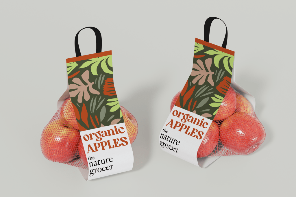
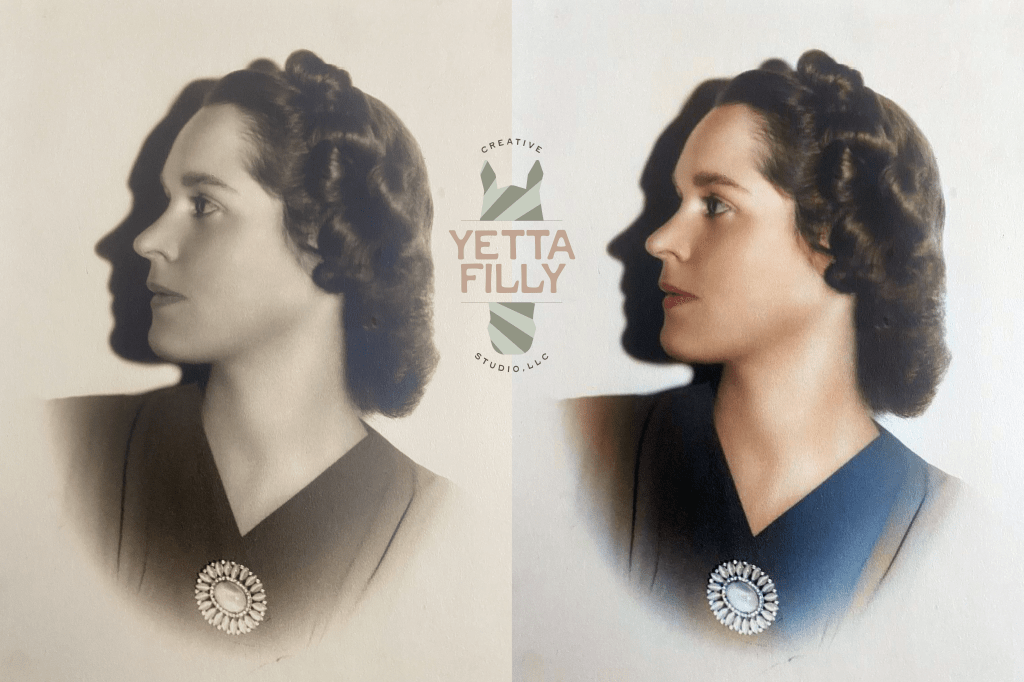
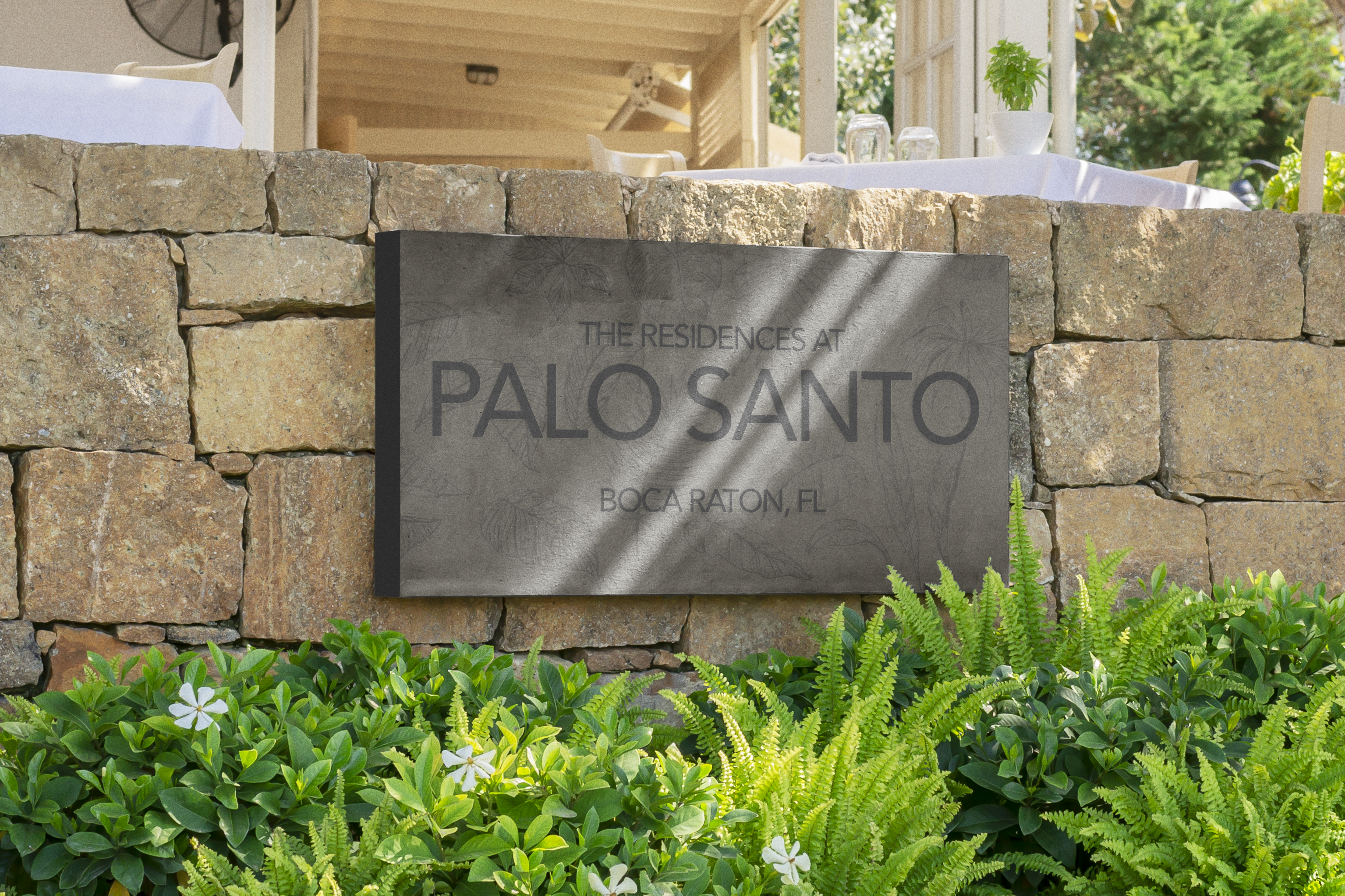
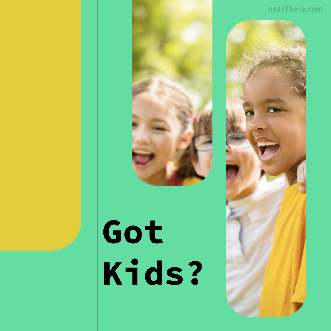
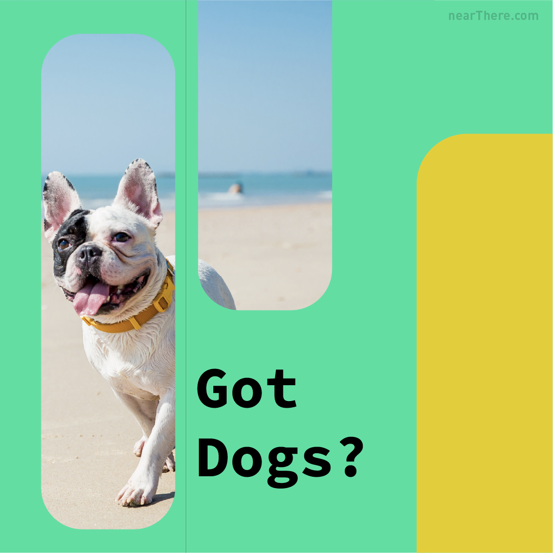
New design alert! We created a logo concept for a funky, modern grocery store with a pop of color! We also specialize in photo restoration through Adobe Photoshop! Please reach out to get the photos of your loved ones restored beautifully.Say hello to the adorable new face of Purrs & Pours Cat Cafe, coming soon to southern New Hampshire! The client requested a fresh, clean and neutral colored logo with some flare. The White Flower Coffee Shop is your new favorite spot! Our A-Frame signage is designed to pull you in and keep you coming back for more. Ready to enhance your storefront? Fauna Flora Nails. This logo was designed for Fauna Flora, a nail brand. The client envisioned a playful concept featuring a cat holding a fish, and we delivered just that. The package featured gold foil accents in the yellow areas, along with high-quality prints of professional business cards.The Residences at Palo Santo. This sign design was made with environmental considerations at the forefront. Given Florida’s humid climate, we chose to etch a native palm tree motif into a durable stone slab, ensuring both aesthetic appeal and longevity. Any time we come up with a design we ask ourselves where is this design going to live?nearThere. This collection of Instagram concepts was designed for the app company nearThere, aiming to highlight their innovative real estate search engine. Utilizing their signature minty-green color, the visuals effectively capture attention and convey the brand’s unique identity.nearThere. This collection of Instagram concepts was designed for the app company nearThere, aiming to highlight their innovative real estate search engine. Utilizing their signature minty-green color, the visuals effectively capture attention and convey the brand’s unique identity.
nearThere. This collection of Instagram concepts was designed for the app company nearThere, aiming to highlight their innovative real estate search engine. By incorporating their signature minty-green hue, the branding achieves a contemporary feel while also evoking a sense of nostalgia. This unique color choice not only enhances visual appeal but also reinforces the company’s identity in a competitive market.nearThere. This collection of Instagram concepts was designed for the app company nearThere, aiming to highlight their innovative real estate search engine. By incorporating their signature minty-green hue, the branding achieves a contemporary feel while also evoking a sense of nostalgia. This unique color choice not only enhances visual appeal but also reinforces the company’s identity in a competitive market.Museum of Victorian History. We prioritize environmental considerations in our design process, aiming to create a banner that is both visible from a distance and suitable for display on a building’s side. By blending contemporary patterns with Victorian elegance, we successfully crafted a striking banner that captures attention and enhances its surroundings.One Palm Clothing. This concept was crafted for a clothing brand aiming to convey a sense of nostalgia.
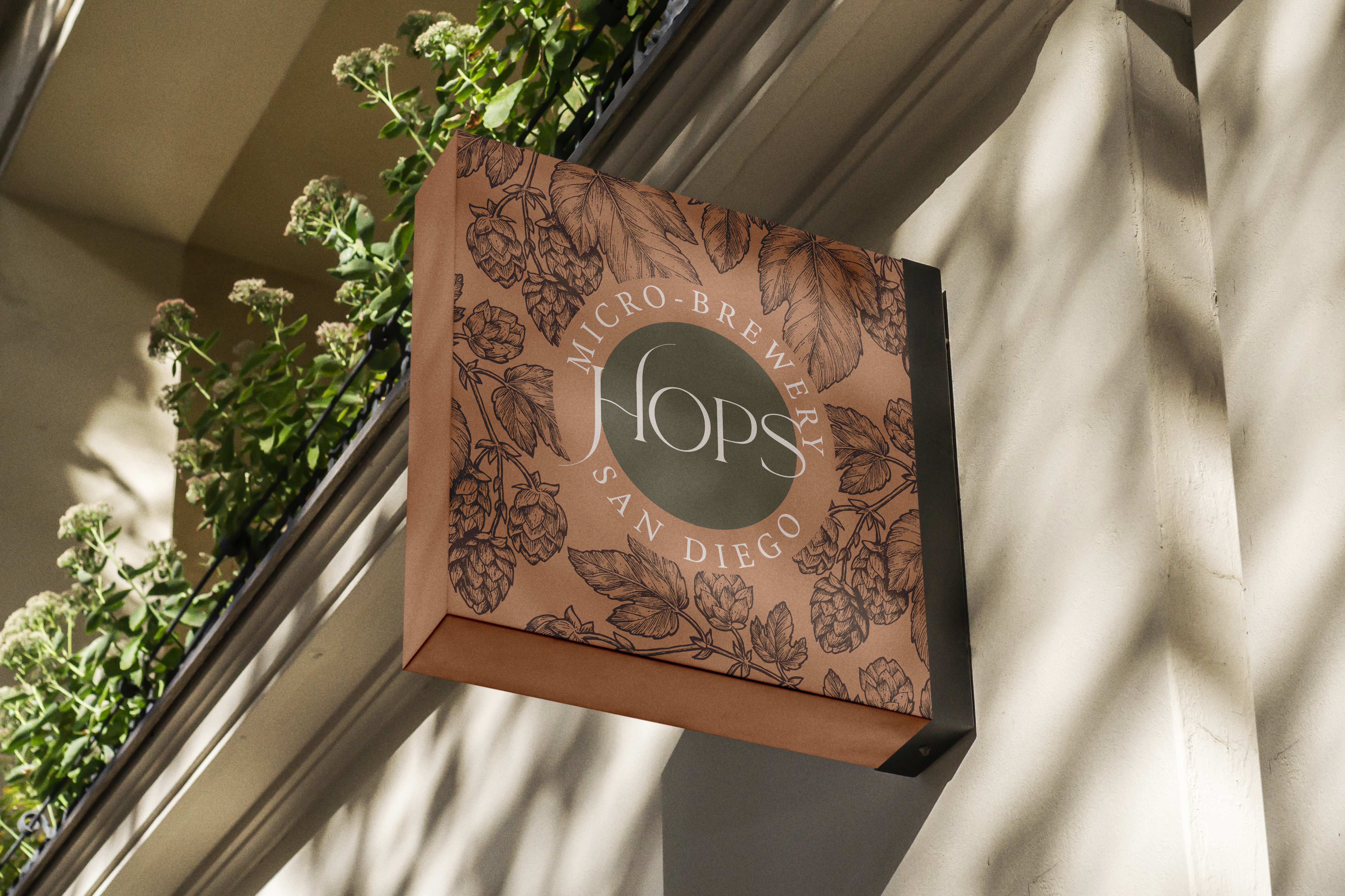
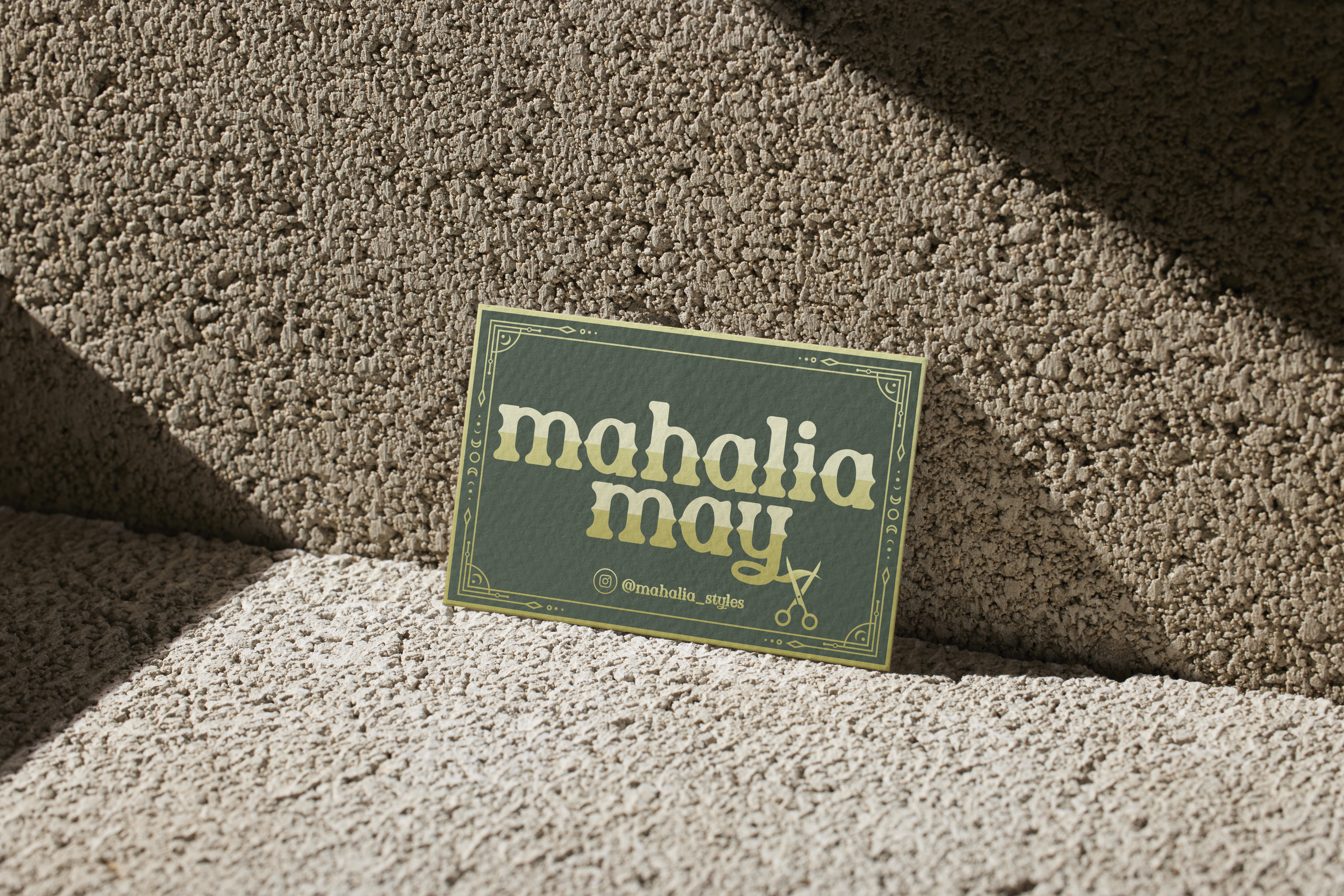
The Tulip Thrift Store. The design draws inspiration from vintage aesthetics, perfectly aligning with the essence of a retro thrift store. HOPS Micro-Brewery. We aimed to craft a contemporary and atmospheric design for this premium brewing company. The design features a pattern of actual hops, while the selected font evokes the essence of hop vines. This thoughtful combination not only enhances the visual appeal but also connects the design to its roots in brewing culture.Harbor Fish Market. As a business rooted in New England, we were thrilled to develop a stunning classic seafood sign concept that captures the essence of our coastal heritage.Mahalia Styles. The business card showcased here embodies a metaphysical aesthetic tailored for a hair salon.
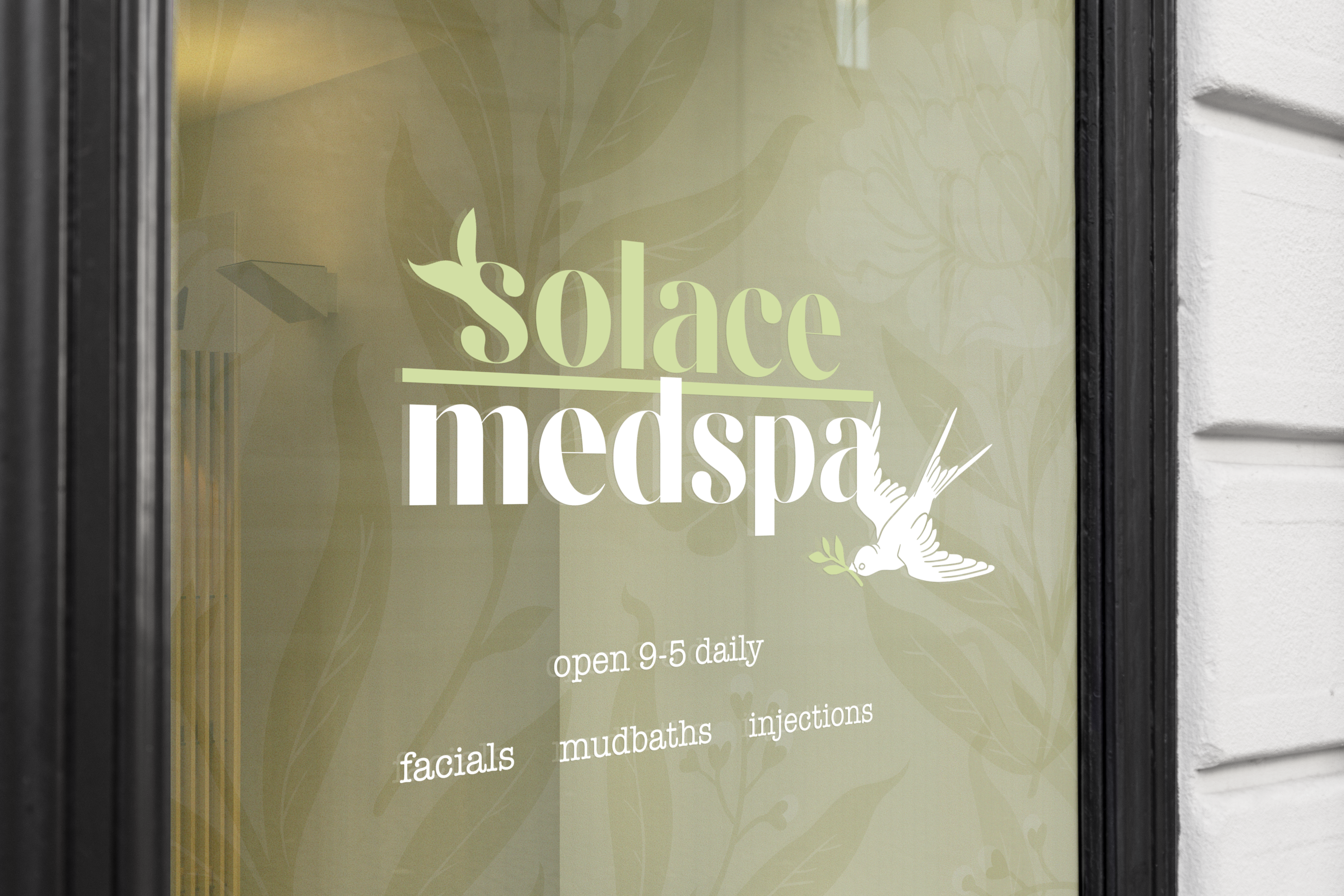
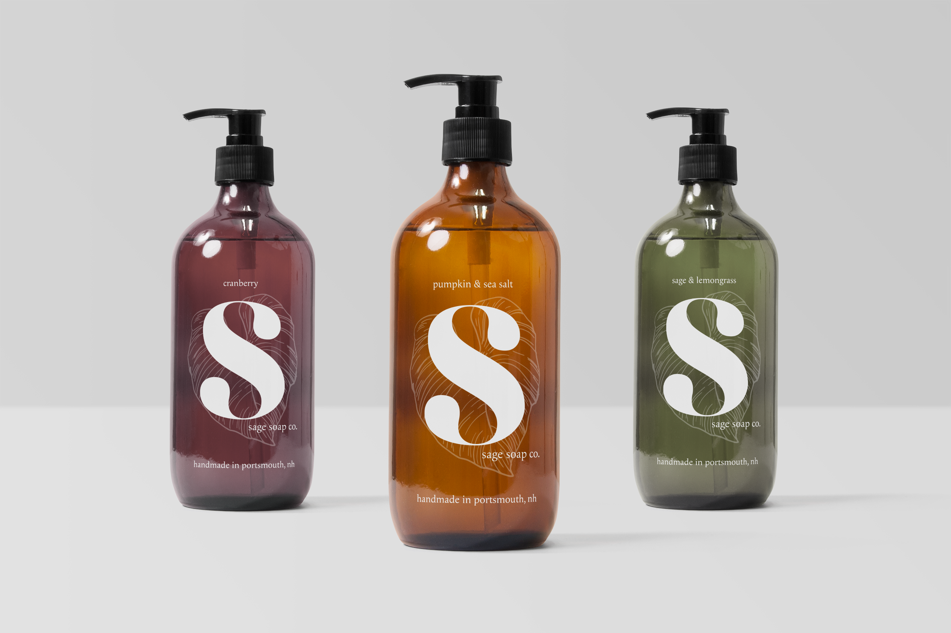
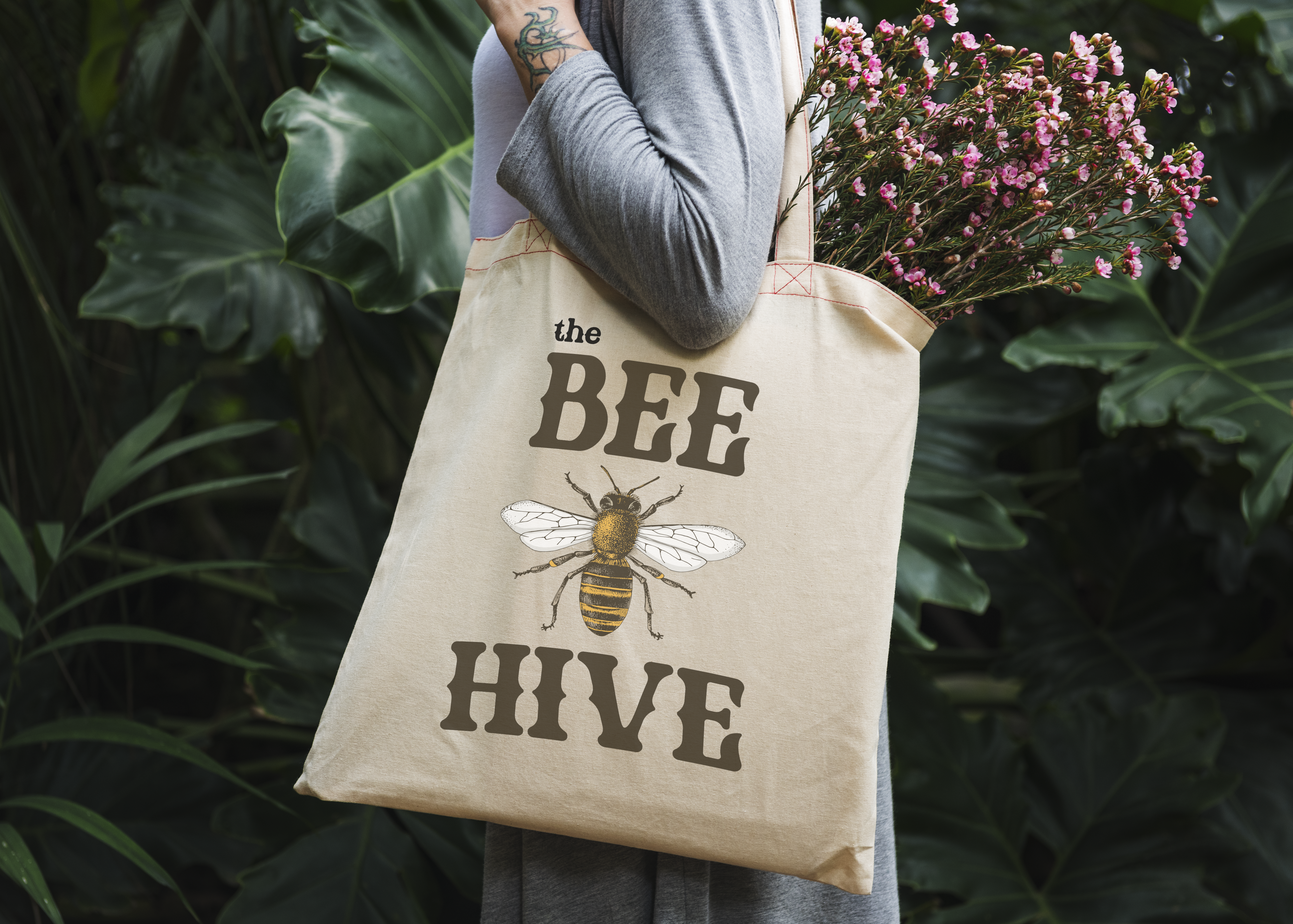
Green Oasis Coffee. By incorporating a coffee plant pattern and a rich, moody green color, we created a product packaging that captures your eye.Solace Medspa. The client envisioned a tranquil and rejuvenating aesthetic for their medspa, leading us to design a logo that embodies the essence of a sprouting plant. This design is complemented by an elegant sparrow, which emphasize the serene and peaceful atmosphere the client aims to create for their customers.Sage Soap Company. This logo was made with the product in mind. Our expertise in product analysis and design theory distinguishes us from the competition. We prioritize a deep understanding of your product, ensuring that our approach is tailored to meet your specific needs and goals.The Bee Hive. This logo was designed for an antique shop in Milford, NH, where the client expressed a desire to incorporate a bee into the design. We embraced this concept and crafted a timeless logo that is versatile enough to be used on various items, including the tote bag featured.
Say hello to the new logo for Washington General Store, Located in Washington, NH! A nod to the past with a timeless appeal, this design captures the essence of the town of Washington’s rich history.
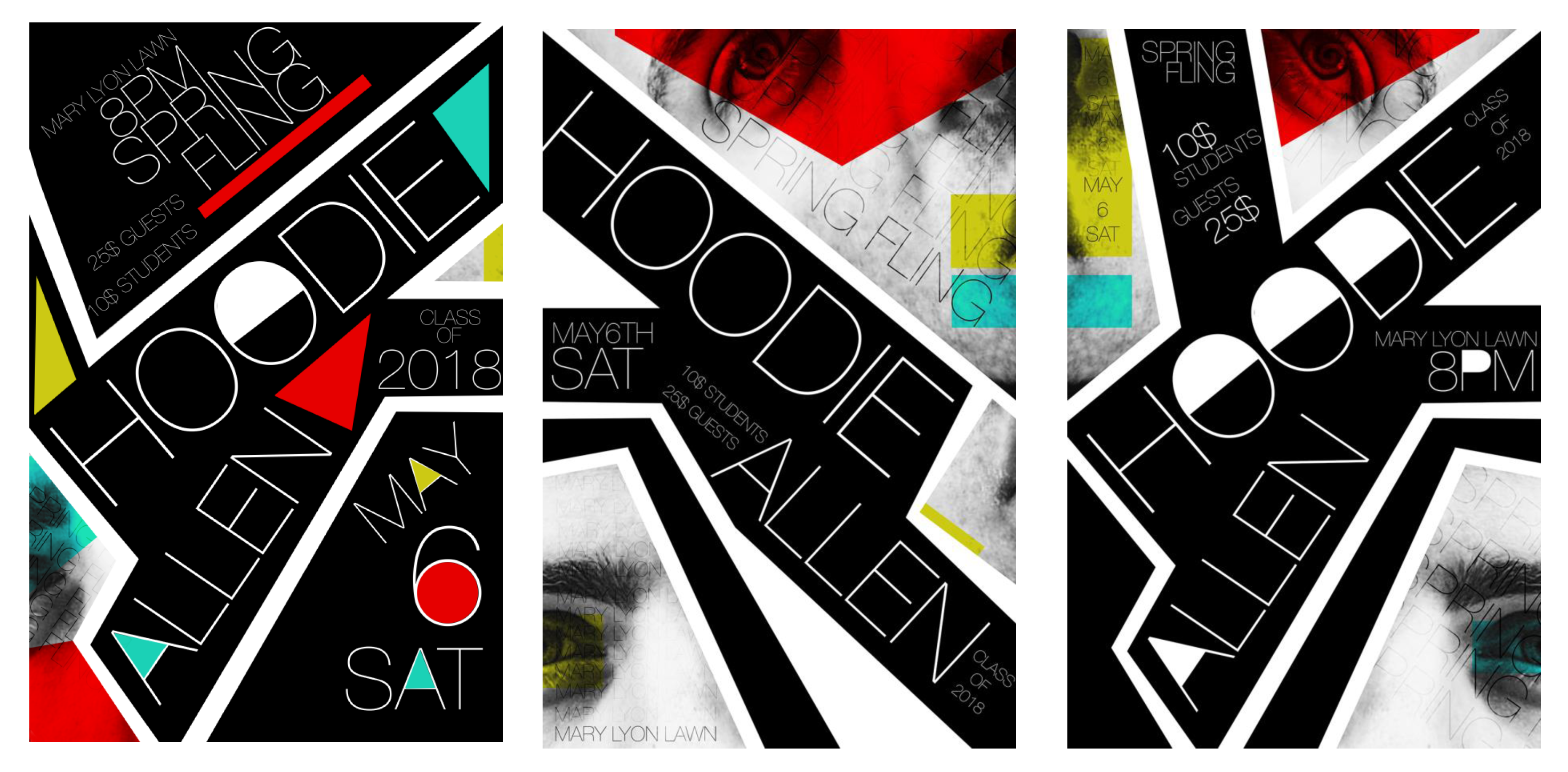
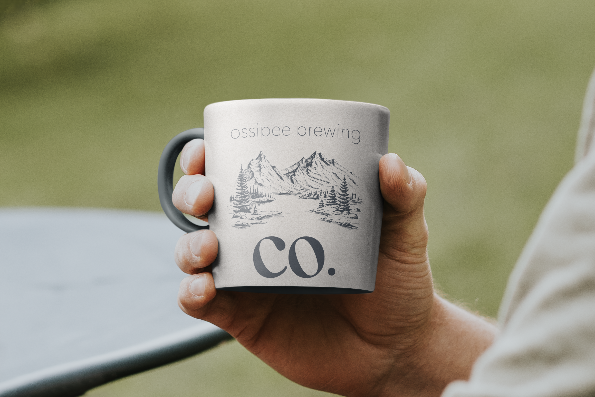
Hoodie Allen Spring Fling Concert. This vibrant abstract poster design effectively promotes Hoodie Allen’s upcoming performance at the university. By incorporating bold colors, we aimed to create an eye-catching visual that draws attention and generates excitement for the event.Ossipee Brewing Company. We created this logo with New Hampshire’s roots in mind – The picturesque mountains that are so abundant. A memorable logo fosters customer loyalty. In designing your logo, we prioritize the specific audience you aim to engage. This strategic approach ensures that your brand resonates with potential customers, ultimately leading to lasting relationships.Veneto Wine. We have designed this wine bottle packaging by combining a classic renaissance painting with contemporary text, creating a unique and visually striking product that stands out on the shelf.
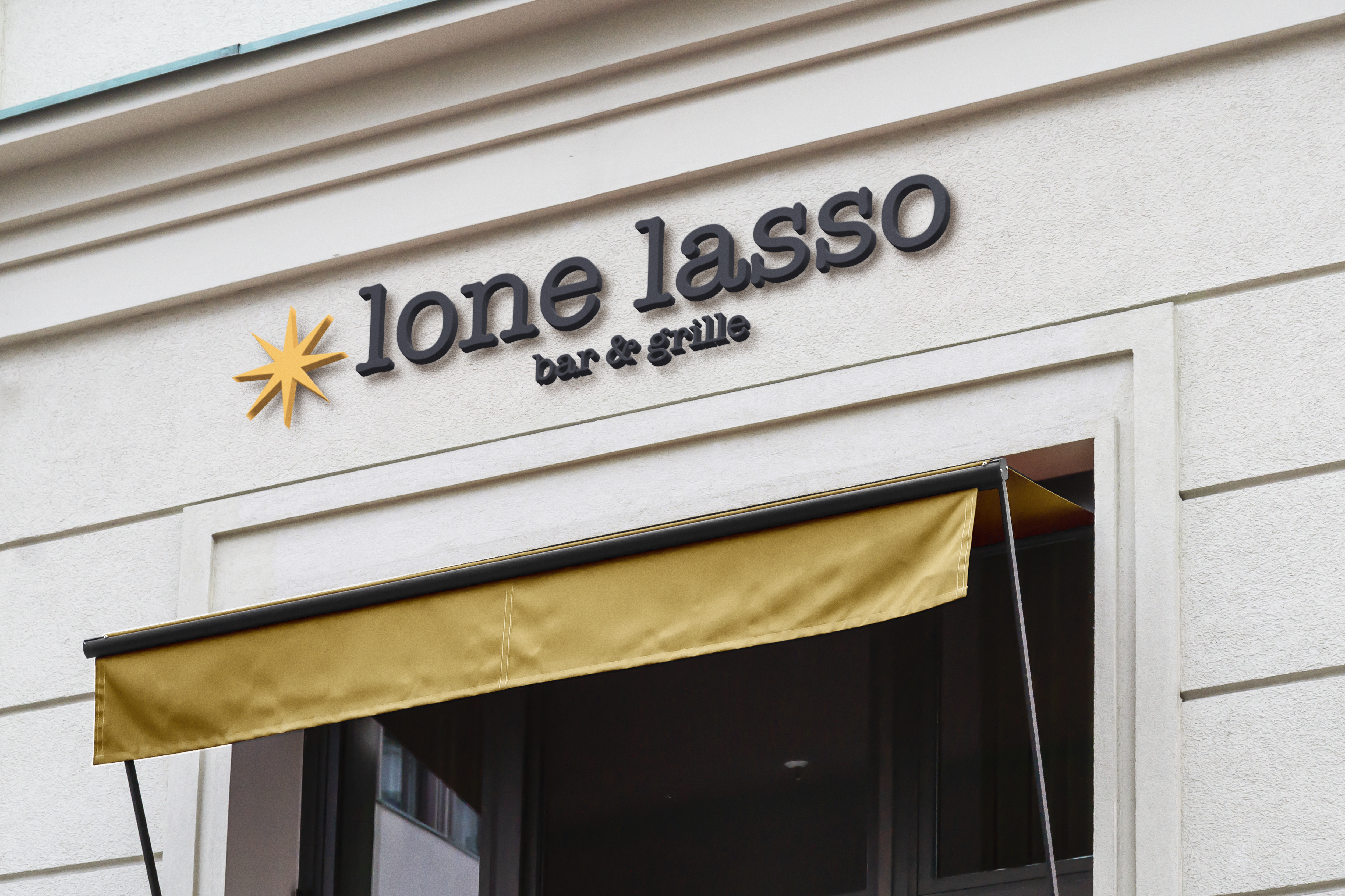
Chateau de L’aigle. This website was designed to highlight the stunning wedding venue, beautifully represented by a lavender-themed logo that captures its charm.Withington’s. A company with a rich history spanning over 40 years sought a design that would endure through the ages. We modernized their existing logo and crafted timeless business cards that reflect their legacy while appealing to contemporary aesthetics.Lone Lasso Bar & Grille. The modern grill sought a sign design that balanced contemporary aesthetics with a playful touch, particularly reflected in the chosen font. This approach not only enhances the brand’s identity but also attracts attention in a vibrant and engaging way.
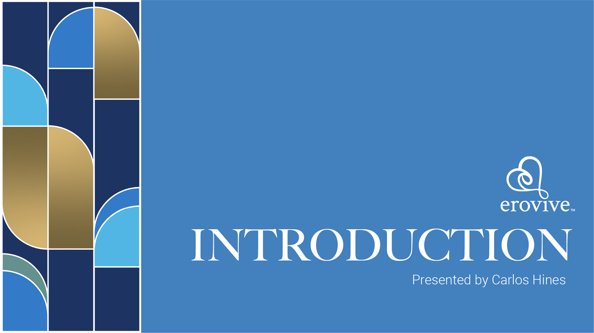
Erovive Group. Erovive sought to establish a branding guideline that encapsulates the essence of safety, collaboration, and honesty for their couples therapy practice. We carefully selected colors that not only promote healing among couples but also align with the principles of pattern theory, ensuring a visual identity that resonates with their mission.Erovive Group, Social Media. Erovive sought to establish a social media package that encapsulates the essence of safety, collaboration, and honesty for their couples therapy practice. We carefully selected colors that not only promote healing among couples but also align with the principles of pattern theory, ensuring a visual identity that resonates with their mission.
We create designs that make your brand unforgettable. Get started with us today.